Thin people look younger. Take heed, Los Angeles.

Topic for Illustration Friday: skinny.
This is also Wordless Wednesday, but forget that idea right now. I will never be wordless. Back when people designed stationary I designed some for editors that said at the bottom, …because pictures speak louder with words. A cartoon is not an illustration, and vice versa!
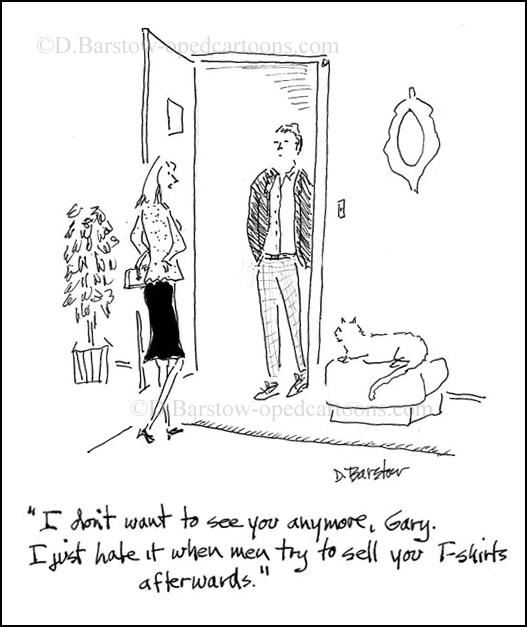
In a good cartoon, the words and pic work together, and one without the other isn’t so funny. If the gag doesn’t work, it’s just stupid. But if it’s a good gag, you need to up your drawing to keep pace with it, and make it even better. There’s a background, a time and place and future in a good cartoon. It’s your stage, so use it wisely.
I did this cartoon for my 2nd book, Love Me or Go To Hell: True Love Cartoons. One of my great cartoon contributors, Stephanie Piro, had thought up the first part of the title a few years ago, and offered it for this project. I added the 2nd part, to make sure readers knew it was a book about loving men, not hating them!??
3 Comments